bottom bar
In this article I'll go through many mobile bottom navigation bars for lifelab. It started with a quick access for elements that are in a side bar under a hamburger menu. I got very simple feedback from my UX friend which left me frantically obssess about round corners and concentric alignment and ruined my entire weekend.
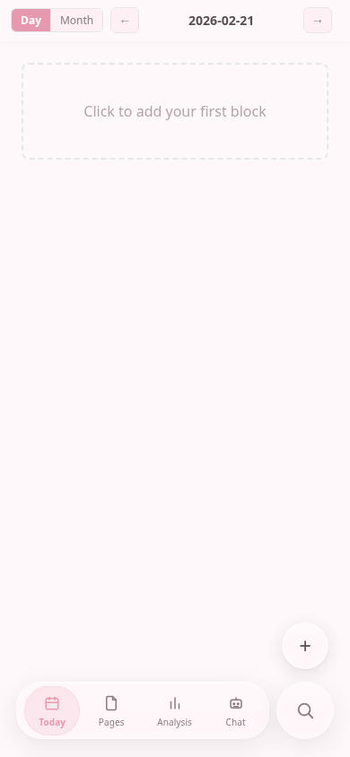
In the first version Claude decided to make the buttons pop out of the bottom bar a tiny bit and it was fairly usable. I liked not wasting space with floating bar and I wanted to push it to the bottom as much as possible to maximize screen estate. The real issue was my block styling, but I learned that later.

V2 - Semi translucent round floaty bar
As I added more functionality, the bottom bar kept increasing and I looked for ways how to organize it via nesting. I wanted to go with Liquid Glass style look and I thought Apple design guidelines might help me (Opus) turn it into something more usable. I was pretty proud of vibe shotting this and I thought I had acquired some sense of taste, but that was very wrong

V3 - More feedback
My friend gave me following feedback:
- Decouple search button from the navigation bar
- The shrinking animation should track vertically (how do you even realize this stuff??) instead of diagonally
- Use icons instead of emojis to work with the colors
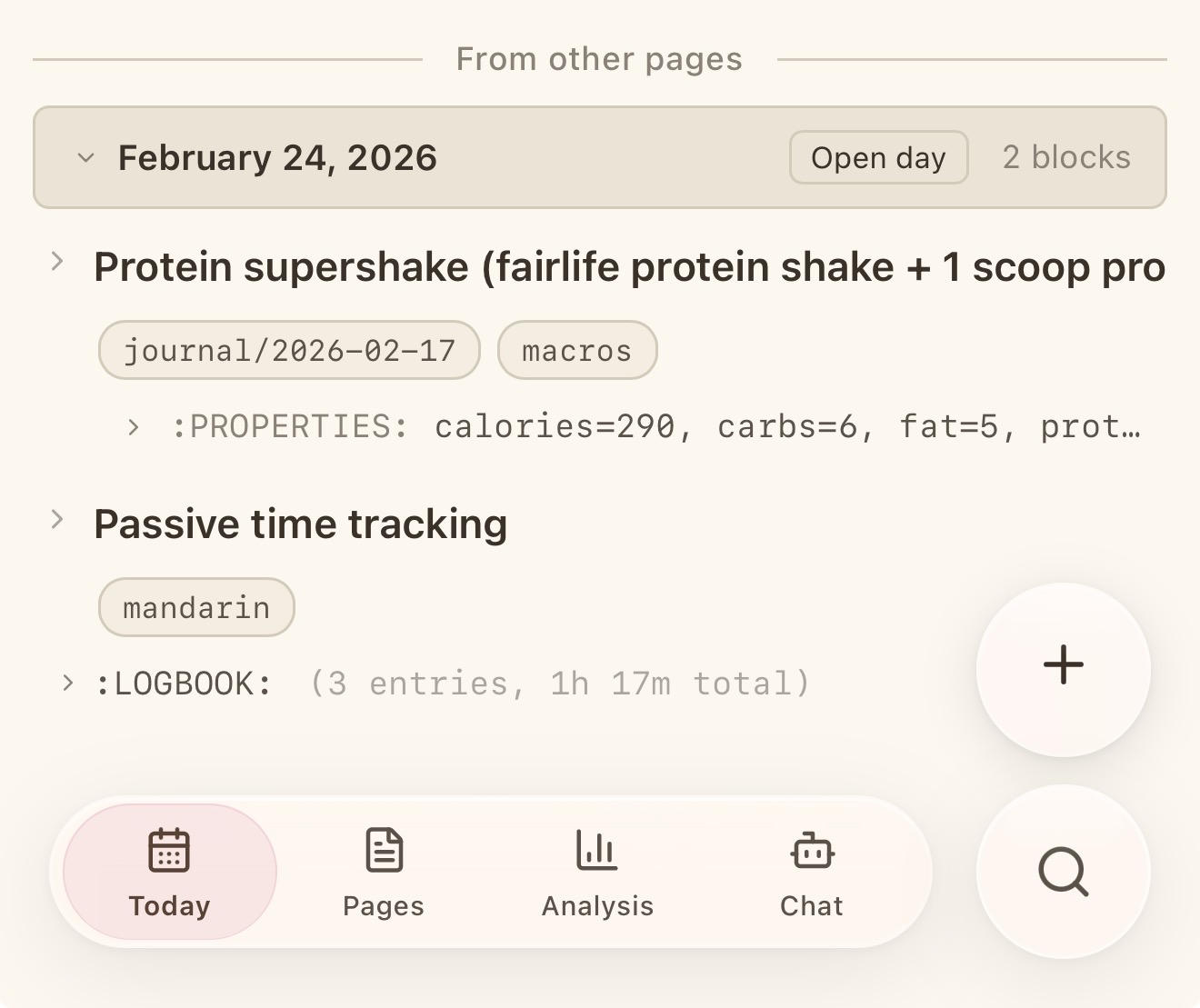
Notice the highlighted Today button is not aligned with the outline of the bottom bar.
I felt the round of feedback to be very valuable as instructions to follow. It was clear, it made sense, it sounded easy. I also did not put any effort in reading the guidelines so I was in complete bliss. However, after this I got feedback that started ruining everything.
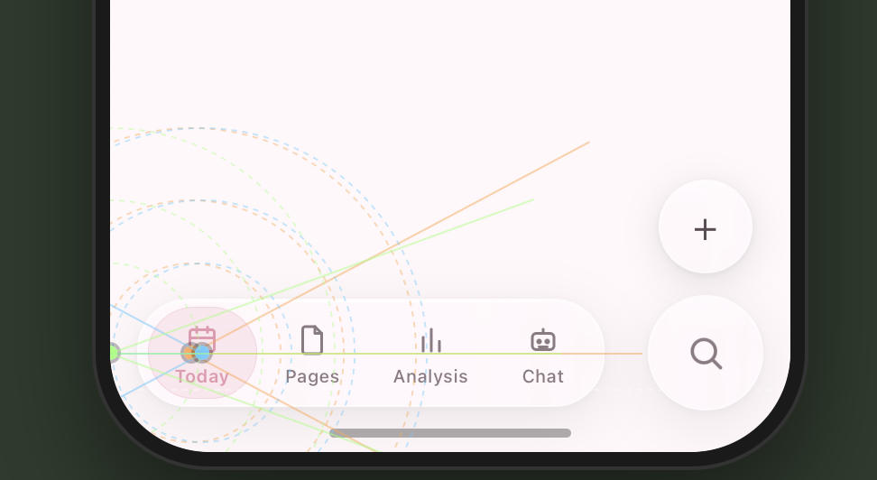
I was told to make it concentric because the menu is poking too much into the corners. I had no idea what concentric even means. After a lot of googling I found out the bottom bar round corners should match the curve of the phone.
The inner element's corner radius should equal the outer radius minus the gap/padding between them
And if the things are aligned in a particular way, they are harmonic and pleasing. Consequently, everything else started feeling is ugly and displeasing.
And my app was in the latter camp. This was also one of the tasks both Codex and Claude code were awful at and I definitely wasted too many tokens before opting to do it myself. I could tell my friends were trying to help me while I was completely flailing and I had some prototypes I was increasingly unhappy with. I even made a harness to visualize the alignment to "get it". As I tuned it I learned more, unrelated things started bothering me and it drove me absolutely nuts.
The learnings
- We go for familiar things but we should understand it
I went subconsciously for a lot of patterns I am familiar with in existing apps, but I never thought about why particular things are there. I remember hamburger menus and icons on bottom, LLM by default regressing-to-mean-behavior also knows both, so I put it there. I did not care about the reason, I just felt "UX" is solved because I pasted instructions lines into claude code.
- React is not SwiftUI
One learning is we should no try to mimic iOS system design in react frontend because there are a lot of variables to make it look properly. Safari does not expose the curvature so there was some guess work to be done to make it concentric and I kept failing and micro-adjusting.
I don't think there is a obvious programatic way to reliably make concentric web-apps but I made it work for my own screen at least.
-
Open your mind Finally, there is an entire vocabulary of terms and concepts to be learned to even reason about design. (which I am still incredibly ignorant about) When I brought up UX to my ML coworkers they just scoffed at me so I had no one to share my excitement about concentric things. That was a minor bummer. I feel a lot of hyper optimized specialist mindset makes you think other aspects are not as important or even worth considering. Learning new stuff is good! Even though it makes you see a lot of flaws in absolutely everything!
-
Just give up man I was hoping to show a polished final result, but the real conclusion is making peace with imperfection. I did not end up make a perfect navigation bar I would be 100% happy with, but I already spent too much time on it and forced myself to say enough.
I really appreciate good design and the amount of thought that went into guidelines, but it is fairly upsetting to know a lot of apps on my phone disregard it and I have to live with this knowledge.
- It's all crab P.S. The final bottom bar with search and + button looks exactly like Slack interface. Is this carcinization?